
Tuesday, April 26, 2016
Composing my Frames
Visceral Response

I chose this image because of the peace that it give. I took this picture my first year at Dixie because of what it felt to me. The warm feeling that comes to this. The mixer of lines and color gives the feeling of a good sunset. With the football field lights standing there in the back while the sky turns into these different colors.
It personally gives me the feeling that nothing could mess up a picture. It is a picture that you can have hanging on a wall in a house. It shows the great sunset that we have in town and brings up unique colors that is rarely seen around the United States.
Communcation Artifact- Visual Poster Design
What I did for my part was to give a visual view on how people would see a restaurant advertisement. When people see a poster or something that is labeling what you are trying to marker they should see that it is simple and gets the point you are trying to sell. With out restaurant Chef Alfredo I wanted to change the way of an everyday Italian restaurant would show.

With this you can tell that it is an Italian restaurant but it looks like something that you see all the time and nothing comes out and gets your attention. It looks like an older logo and doesn't show that it changed for the new times that is now. When I saw this all I thought of was pizza because I have seen logos and signs just like this and that's all they served.

With this you can tell that it is an Italian restaurant but it looks like something that you see all the time and nothing comes out and gets your attention. It looks like an older logo and doesn't show that it changed for the new times that is now. When I saw this all I thought of was pizza because I have seen logos and signs just like this and that's all they served.

What I did was gave a simple change and brought out that fact that it is an Italian restaurant. The color represented as an indication that it was Italian food and is more as a home restaurant then your average Olive Garden. The restaurant has a more classy feeling this any restaurant in town and wanted to show that if people saw their poster around town
Personas:
Cason, 19, is a student at Dixie State University and he is taking his new girlfriend on a date. He has gone to Chef Alfredo's restaurant before and he loves how intimate it is. He is nervous about taking her out on their first official date. When he thinks romantic he thinks Italian and steak. They have a great time there and it becomes their spot for every anniversary.
The Barca family are Italian and they love when their family gets together and has a huge Italian meal. Unfortunately they are far from their family that live in New York. Their family moved down here because they were looking for something more quiet and family friendly. They want to go to a nice Italian place that isn't too mainstream and that is authentic and reminds them of home.
Madison is 23 and just moved to St. George from California. She moved here because of the affordable schooling. When she was in California she liked to explore differ went small restaurants because those were the ones that were the most authentic. She saw a poster on the Sun Tran of Chef Alfredo and was interested to see if it was genuine Italian food or if it was just another Olive Garden.
Objectives:
The goal is that their brand identifies with the type of food he serves there. Currently his identity looks outdated and overdone. The goal is to put the best light on this restaurant to get more people eating at his restaurant.
Tuesday, April 5, 2016
Mis-en Scene: Interstellar (viusal)

Paul J. Franklin is the visual effects lead in this movie. With his good relationship with the director Christopher Nolan, Paul was the only person to fit his ideas of Christopher crazy ideas. With his work on Inception, Mission Impossible-Rouge Nation, and the resent Batman trilogy, this movie was right up his alley to be great.
Gernally visual effects artist have a tough time just to guess what the mind of the director is wanting in their film. But with this movie almost the impossible has to be done. The scene that we had picked had never been done in a movie before. Bringing x, y, and z lines, planes, vertical and horizontal lines, pretty much everything you wanted to have it was in one scene. The whole consecpt was to have you see that no matter where you looked there is another demionsion to look at. Everywhere you looked was a different event happening that was strenghed over time. They had to focus on the darkness of space, unnatural events, as well as effects that will seem so normal to us but twist it into something that no one can explain.
With this movie the were over 100 people working on the visual effects. The effects were brought to bring a 4-demionsion space, to keep the eye from focusing on everything and not make it as confusing as shown. The nature was that each box is a different time on Murph and Cooper relations with that one room.
black hole scene
Thursday, March 24, 2016
composing my frame
\
I chose this because one I almost fall from the stairs
 of lines going through the picture. The vertical
 When I first went into the building I was confused
on where the beginning of the stairs was. At first
I thought they just wanted people to walk and not
be lazy but the design to me is to be different.
Now that I look at in there is a z axis and a lot
and horizontal lines on the background on where
the z axis is form. Walking though the building from
the second floor gives a different feeling that it isn't
a normal stairs.
My focus really was on the stairs to where it was going.
It an infinite wonder on where does it stop. It brings the feeling that if goes to the roof or just stops.
Thursday, March 17, 2016
Web Design

What I chose was a site that I'm on pretty much everyday. Zumiez has a grid
design that is easy to nevgate and find what you are looking for.
But what is good about this site that it is forever making sure
that the biggest deals are in your face.

For anyone who has never been to the site can see how easy it is to find the
more popular items that they sell. Zumiez does a good job of getting you
straight to what you want and has tendency of making you go off and seeing
something else.

With Zumiez grid view on their site it making shopping easy for all ages and
make is simple to find all the deals and hottest items that is on sale. With this
grid view it doesn't have you confused and frustrated in trying to find simple
clothes or anything the have because they pretty much simplify everything.
Tuesday, February 9, 2016
Design Presentaion
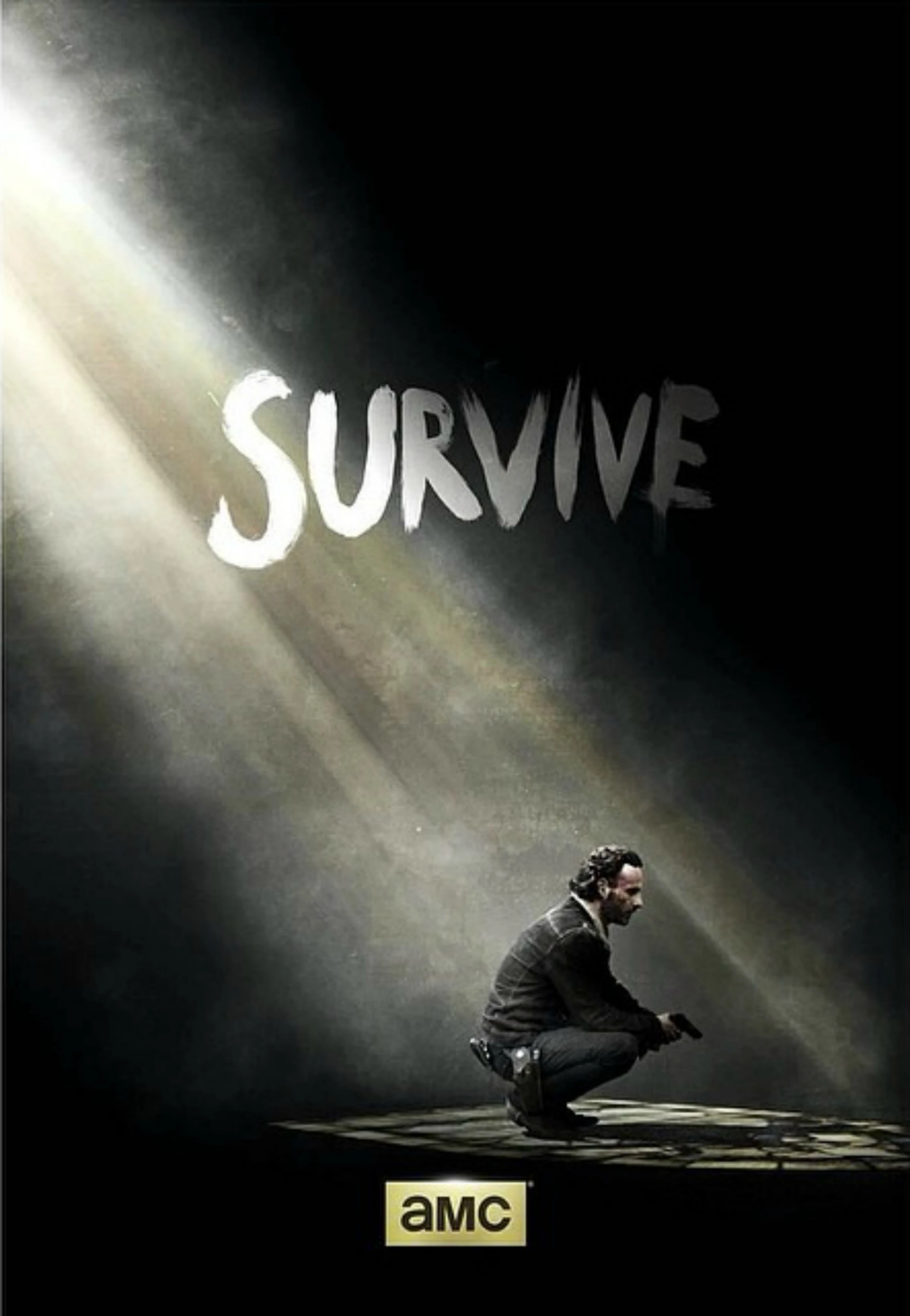
I chose two posters from one my favorite series the walking dead and Marvel Agent of Shield. Both shows are popular in its own way. Walking Dead by the comic book and Marvel by simple being Marvel. The Walking Dead has become the most popular show on TV for years and is still growing with more seasons coming out. But with Marvel on the other hand it is just there because of its name and the movies. The Walking Dead has brought in a ton of posters that make the series still climb to the top and has everyone excited. But the other hand Marvel Agents of Shield doesn't bring any type of excitement to what they are trying to promote.
The Good
The Walking Dead series is one of the greatest series of this generation that has been shown on TV. Just the simple fact that its zombies excites people and get hooked. The show brings a lot of imagination and a deep story that is hard to compare. Just looking at this poster already have you guessing what the show is about and what the meaning on what the show is suppose to be about. Just the simple word "SURVIVE" and with the beaming light showing on Rick meaning that is there is light in dark times. The fact the millions of fans that watch this show already know the hard times the characters deal with and what they have to do to survive.
The Bad
How can a Marvel series or Marvel anything be bad! Well the show isn't all bad but the posters, the imagine it try to show isn't working. The show it self is hard to understand what is exactly going on. But what I want to focus on is the poster shown here. I see that they were trying to use the sun glare in the background but its distracting from the whole picture. Knowing the Marvel universe you can see if someone has some sort of special power or not. This doesn't and makes me think that its just a bunch of normal people trying to play hero, which Marvel isn't about.

Thursday, January 28, 2016
Harmony

If you ever had gotten to know me I am a sucker for looking out into the stars. I love to get lost in the wonder of time and space. The feeling of being lost into something that has never been seen up close is exciting. Looking up in the stars clears my mind and makes me realize that there is more to offer out in the universe. So this pictures reminds me that never stop believing and be the best out of life.
The picture shows the clear night sky with a beautiful image of hundreds of stars. The shadow hill shows that it could be close and not far away. It also shows that it could be a ship of some kind looking down on us or a huge explosion is happening. The color of the yellow, blue, and purple makes you wonder what is going on up there, that only our imagination can fill.
Subscribe to:
Posts (Atom)